A Beautiful New Template For Your Knowledge Base
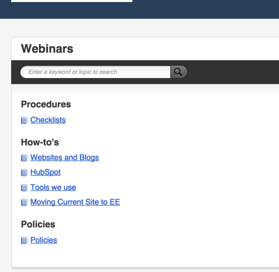
The old knowledge base template was a little outdated, and looked like this:

Which is fine, if you like that that look. But some of you mentioned that it was too text-heavy and difficult to navigate through when you had a lot of documentation (and many of you have A LOT of documentation... like, over 400 articles).
So, last week, we released a new template to make your knowledge base a little snazzier looking.
It's more visual, easier to customize, and your customers are going to think your documentation looks really professional.
It's available for all plan levels, you can preview the template before you hit "Publish," and you can always revert back to the older template if your customers don't like the new look.


.png)
