

We obviously believe that adding screen captures to software documentation makes a huge difference. We would go so far as to say that it is the difference between software documentation that produces business results and software documentation that creates door stops.
But simply adding pictures isn't enough. You have to add the right pictures in the right way.
When we add screen captures to our software documentation we have one goal in mind: clarity. Clarity is all that matters. I want my reader to be able to quickly glance at the screenshot and move on. I want them to only have to process as much visual information as is absolutely necessary.
Too much visual information will cause them to have to "study" the screenshot. Not enough visual information will force them to hunt through the application interface.
There are a variety of factors that can contribute to clarity, but in this article we are going to focus on size. If you get the size of your screen captures right then you will make big improvements to the effectiveness of your software documentation.
The goal
First, let's talk about the goal for our documentation example. In this example we want to show the user how to export a lesson to the clipboard in ScreenSteps. To do this they will need to click on the Clipboard icon. An example is shown below.

Too big
Screen captures that are too big *communicate too much information*. By showing too much information it makes it difficult for the reader to discern what is important.
This first example captures my entire desktop.
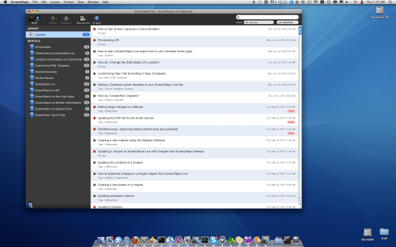
The problems with this image are obvious. I have captured so much of my screen that the Clipboard icon is hardly visible. The extra data doesn't add any value to the screen capture. It doesn't add clarity. It just adds confusion.
Still too big
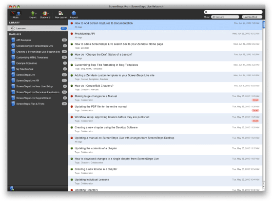
The type of screenshot shown above is much more common. Capturing an entire window is easy and it looks nice and clean. But the only thing I need to show in my documentation right now is the Clipboard icon so this is still way too much visual information.
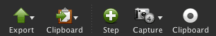
Too small
This approach to adding images to software documentation is very common:
Why do authors do this? To save themselves the hassle of having to update their screenshots when their application changes. The thinking goes: "If I *only* have a picture of the Clipboard icon then it doesn't matter where that crazy software engineer decides to put it. I don't have to update my documentation."
The amount of frustration you will cause your users simply isn't worth the time savings. Don't do this.
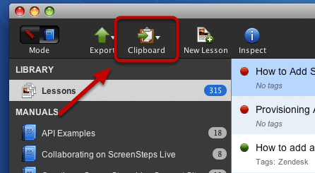
Still too small
Just right
Here is what I feel is an ideal size for the screen capture:
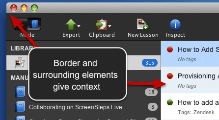
1. We haven't cropped the application window to remove the desktop background. Showing the borders of the interface help the user quickly orient themselves. Whenever possible, I like to get a corner of the interface in the screenshot. Including corners helps the user know if they should be looking top-left, top-right, bottom-left or bottom-right when following my instructions.
2. We include surrounding interface elements. Once again, we are trying to provide context. By including the surrounding elements I can give the user more "guide posts" that will help them locate the Clipboard button when actually using the ScreenSteps application.
Focus on what matters
I have worked with many technical writers who don't like the look of this type of screenshot. They would prefer that the edges be tightly cropped for a nice, clean appearance. They are worried about aesthetics. I am mostly concerned about clarity.
Aesthetics will give you a very nice presentation piece to show your friends. Clarity will decrease customer support requests, improve user satisfaction][improve-user-satisfaction, and improve your business.
Check out our eBook for more tips on creating better software documentation.