Article Makeover: Modifying a Chargify Help Article Using Workflows
Chargify is a SaaS product for managing revenue. I was checking out its customer support knowledge base and saw a few help articles that could potentially be a little easier to read if they were converted into workflow articles.
In this blog post, I'll walk you through how I (if Chargify ever asked me to) would make over the article using the ScreenSteps Workflow Article type.
The Article As it Currently Stands
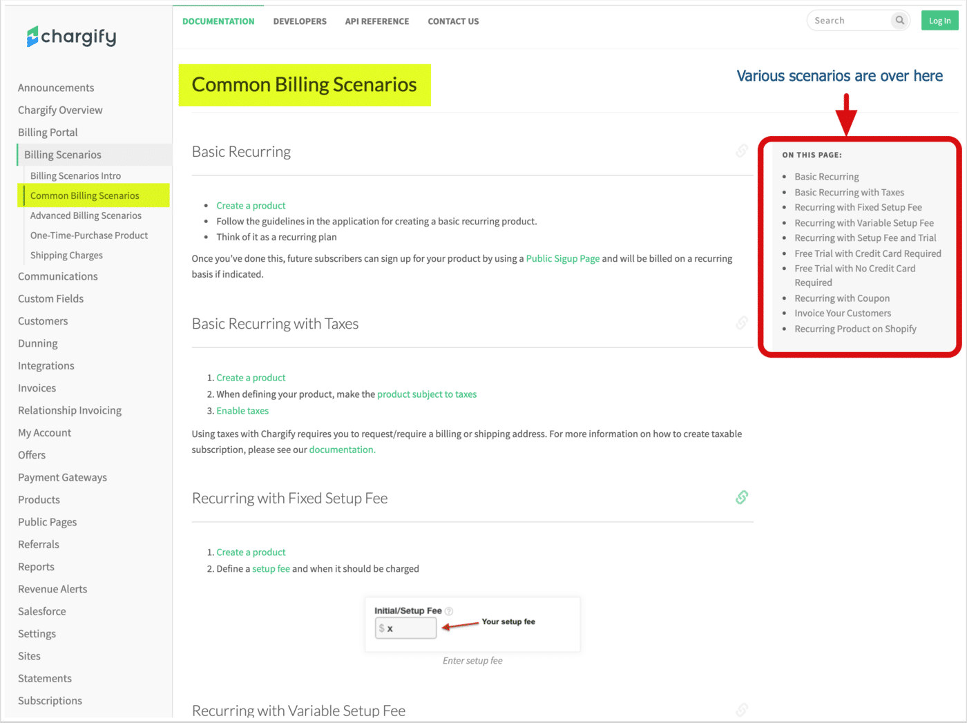
The help article is called, "Common Billing Scenarios." As you can see in the screenshot below, it's an article that explains different scenarios you may need to bill customers and how you would set up your Chargify products as a result. There is a navigation on the left that jumps you to different articles in the knowledge base, and there is a table of contents on the right that jumps you down to specific sections in the article.
What's wrong with it?
I'm not sure if anything is wrong with this article. This article is set up nicely and I have no idea how many follow-up calls and back-and-forth emails they receive around this topic. If they don't get any, then the article is perfect! It does its job of helping end-users perform the task of setting up products in the system.
Having said that, we can still learn a lot by giving this article a workflow makeover as there are some improvements that could be made so that the instructions are easier to read through. Let's take a look at some of the challenges that this article may pose.
Two areas of improvement
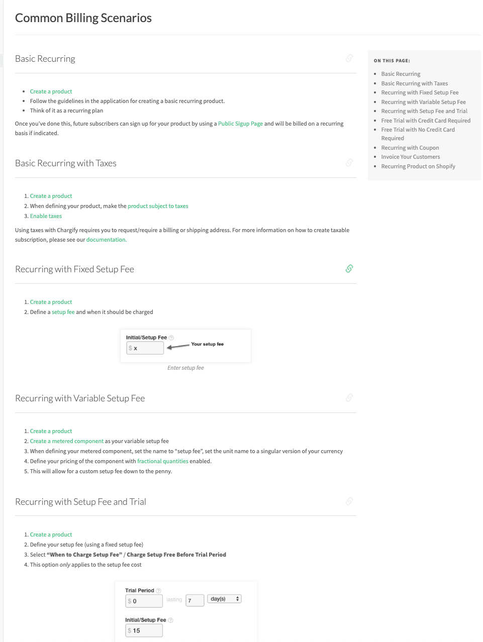
The first thing I noticed was that the links take you off the page. In the top section of the screenshot below, clicking the "Create a product link" takes you to the article called, "Product Editing." Leaving the main help article can be confusing to readers if they have to click the back button in their browser and figure out where they are.
The second thing I noticed is that when viewing a specific section of the article, it's easy for my eye to wander and for me to get a little overwhelmed by all the content. In the screenshot below, I can see five different sets of instructions for different scenarios. Perhaps that's not a big deal, but being able to scroll through different sets of instructions can make it difficult to keep track of where one is in the article – especially if clicking on links and having to click the back button in the browser.
The Workflow Alternative
Using the workflow article in ScreenSteps gives us a few more options that make the article easier to read, resulting in fewer follow-up questions and back-and-forth emails.
Option 1: Present the scenarios as buttons
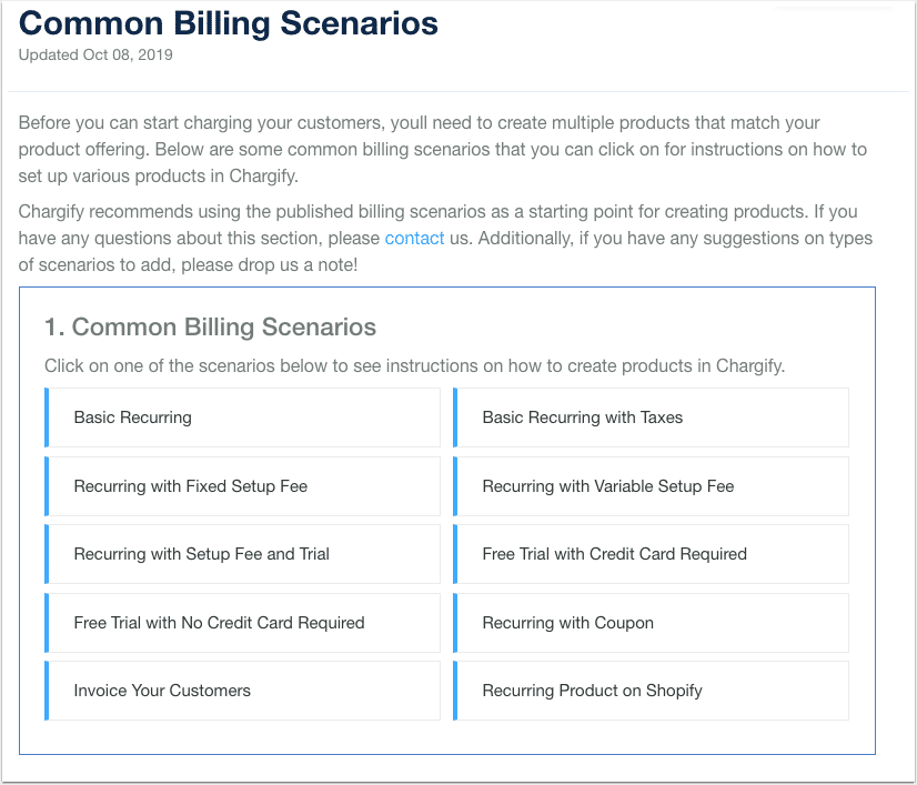
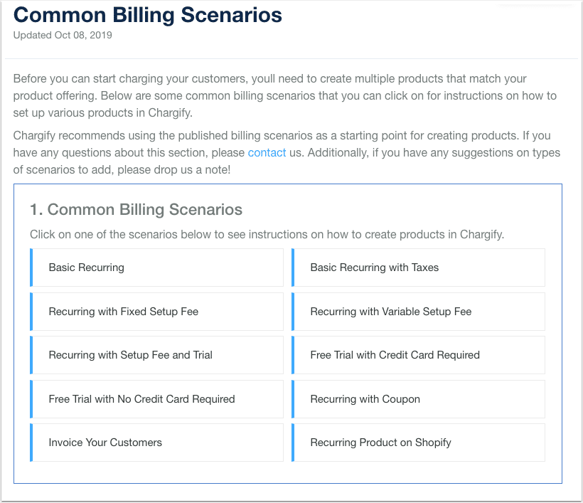
Chargify's original article included a table of contents to help you jump to the specific scenario you had a question about. In the Workflow article, you could include a list of scenarios and present them as buttons (screenshot below).
Option 2: Only show the relevant instructions
The nice thing about this approach is that when you click on one of the buttons, the ScreenSteps Workflow Article presents you with only the instructions for your selection (see screenshot below).
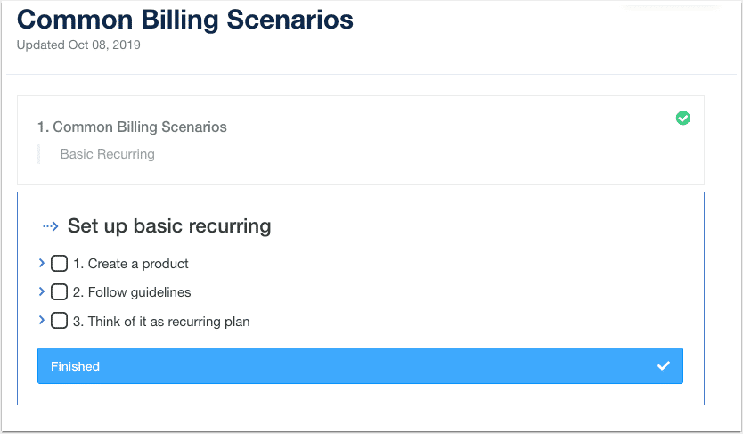
This prevents readers from skipping over details or getting confused about which set of instructions are relevant.
Option 3: Use Checklists
In the original article, each task is listed as a bullet point. In the Workflow article, you can present steps as checklist items that can be checked off (see screenshot below).
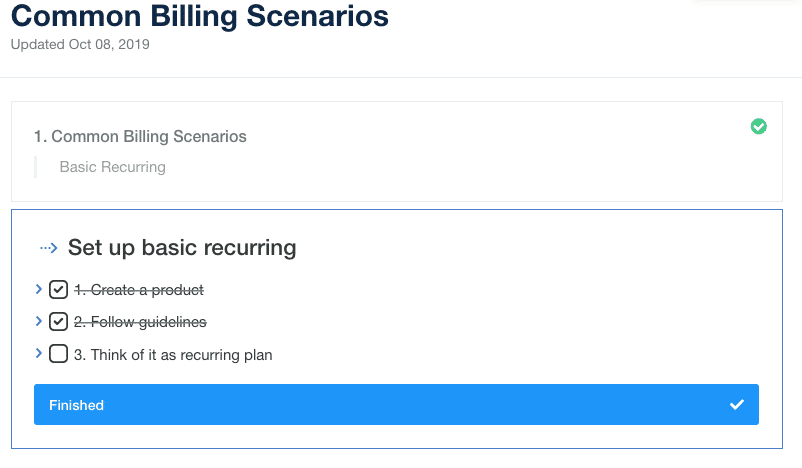
Not only does the checklist help readers comprehend the big picture of what's needed to complete the task, but you can also include additional information under each checklist item (see screenshot below). If the reader has questions about how to perform a specific task, more details can be included beneath each checklist item.
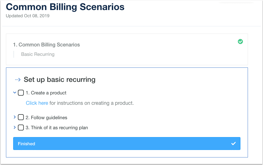
Option 4: Inline Links
Within each checklist item, you can create inline links. That means you can link out to more detailed procedures (e.g. instructions for creating a product) and show the linked-to article as a modal (see screenshot below).
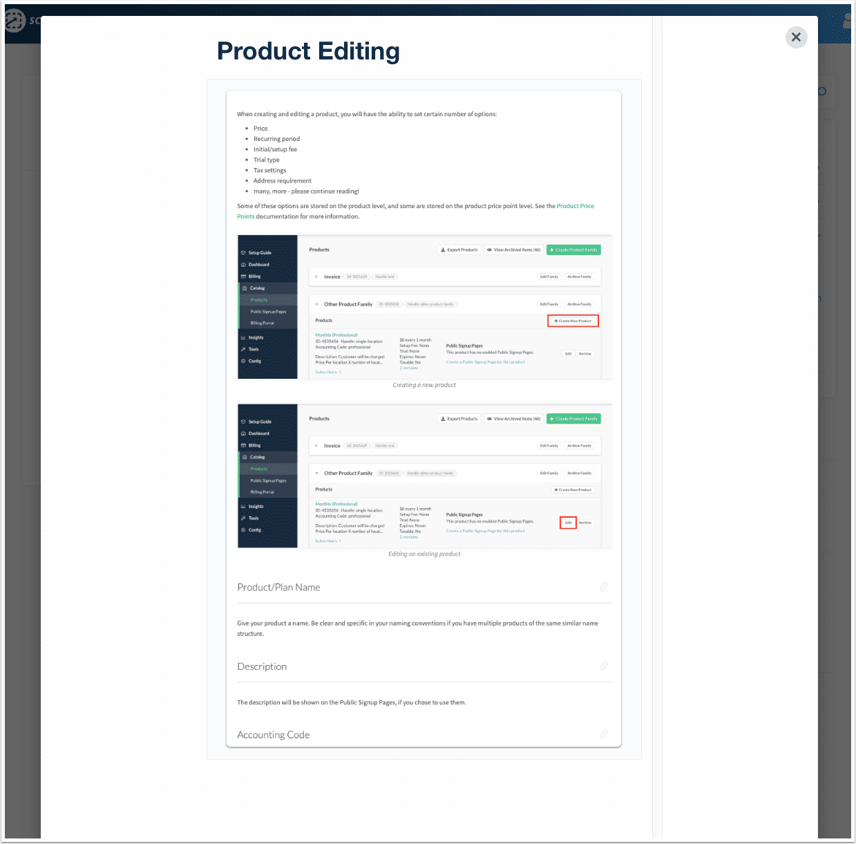
This allows readers to see more detailed information without leaving the original article. When the reader is done with the article, they can close it out and return to the instructions and continue with the tutorial.
Option 5: Return to previous sections
If your readers want to return to a previous menu or set of instructions, they can. For example, in the screenshot below a reader would simply click "1. Common Billing Scenarios" and she would return to the beginning so she could choose a different option.

From here, she could choose a different path that would walk through the specific instructions on how to prepare a product in Chargify based on another specific scenario.
What's the point?
The sole purpose of using a Workflow Article is to avoid unnecessary calls and back-and-forth emails asking for clarification. With the ScreenSteps Workflow Article, you can help end-users find the exact instructions they need (nothing more) and preemptively address questions that you know are going to come up – and do it without overwhelming readers with information.
If you want to try workflow articles, request a free trial of ScreenSteps! Or, if you are already a ScreenSteps customer, contact support to see if you have the workflows option on your account!


.png)