

About a year ago we hosted a [webinar on software documentation][software-webinar]. During the webinar we showed an image annotation technique that is very common and, in our opinion, very ineffective. One of the participants in the webinar said they called the type of image an "Octopus graphic".
What is an Octopus graphic?
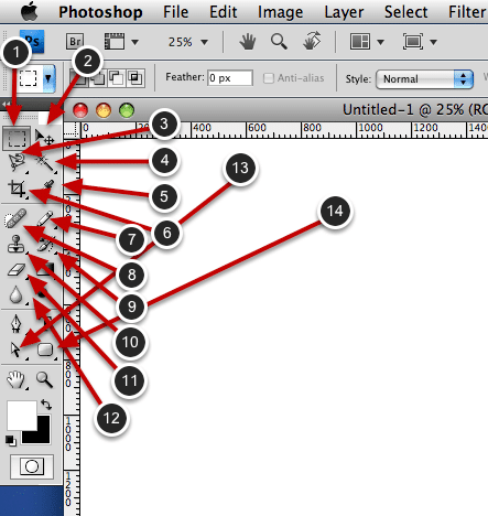
An Octopus graphic is a screenshot that has been abused by the ScreenSteps sequence tool or other image annotation tools. Look at the graphic below:

Octopus graphics have many, many labels describing different buttons (obviously we have exaggerated a little in the example above). This seems to be a popular approach among technical writers which we feel delivers very little value to end users.
What are the problems?
1. Octopuses describe features not tasks.
Listing the names of buttons is of little use. This function can often be handled by a well placed tool tip in the interface. It is much more important to teach your users how to accomplish tasks. If you are teaching tasks then you will very rarely need octopus graphics.
2. Octopuses are cluttered.
With so many labels on the screen it is impossible to process what is going on. If you really feel that you need to label every button in the interface at least break up your labels into different graphics. Try to group the buttons into meaningful collections. People are better able to understand and retain information when it is put into smaller chunks. I would suggest limiting yourself to no more than 5 labels on a single screenshot. A single graphic with a bazillion labels on it presents information in a way that is hard to understand and even more difficult to retain.
3. Octopuses make you think you are done before you actually are.
If you use octopus graphics you run the danger of "documenting" your entire application without delivering any real value to the end user. Once you have labeled everything you may think that you are "done" with your documentation. But your documentation won't deliver any business value to your organization. Your documentation shouldn't be "done" until you have helped users accomplish real-world tasks. Octopus graphics don't help people accomplish tasks.
Throw Out the Octopus
Do you have a lot of screen captures that look like this in your documentation? It is probably a sign that you aren't taking the right approach to writing your docs. You are spending too much time talking about buttons and labels and not enough time talking about tasks. Start creating more "task based" documentation and you won't feel the need to create any octopuses.