10 Examples of Great End-User Documentation
1. Adapt for complex scenarios
Some procedures are straightforward while other procedures include a lot of "if this, then that" situations. If your documentation needs to explain a complex procedure, make sure you account for all of those variations.
Here's an example of what ScreenSteps calls an Interactive Conversation Flow that a call center agent could use to respond to a call about the Paycheck Protection Program. (Click YES or NO to try it out.)
The idea is to help the end-user (in this case a call center agent) respond to any scenario related to questions coming in around the Paycheck Protection Program by including prompts and decision trees.
Note: If you're writing complex documentation in Word or Wikis that aren't interactive, then you could include instructions that say, "If this is the situation, jump down to step #7. Otherwise, continue on." Not quite as easy to read, but can still be effective if that's all you have. If you want to create an Interactive Conversation Flow like the one above and the one below, check out ScreenSteps.
Here's another example of the same type of article, but this one is meant for customers to use as self-service (click on one of the options to go through the procedure).
These articles come in very handy when you want to direct users (either employees, customers, or call agents) to specific instructions that need to be tailored to a situation. We call them Interactive Conversation Flows because they help call center agents respond to callers in a conversational way and because when customers use them for self-service, they can recreate the conversation a support rep would have to narrow down what needs to be done.
For example, think about how much time it would take to write an article titled "Contacts." You wouldn't know where to start. So you create an outline of all the "Contacts" topics you can think of, take screenshots of the Contacts object, explain all of the menu options, and write a history of the Contacts object - all useless to an end user who just wants to know how to create a partner contact in Salesforce. Instead of going right to the information they need, end users will have to sift through all of the other stuff to find an answer.
If each article has its own, great title, then your end users can quickly answer their own questions by performing a keyword search or by browsing through your table of contents.

HubSpot does a great job writing useful titles, and then demonstrating the workflow using pictures, text, and annotations. Their documentation is a great example of how to write end user/customer documentation.

Tip for writing great titles
To continue the example from above, instead of writing one big article titled "Contacts" just write a dozen little articles that each answer one specific question:
- What is a contact?
- How do we use contacts?
- How to create customer contacts
- How to convert a lead into a contact
- How to create partner contacts
- How to create an account for a contact
- How to merge duplicate contacts
- How to import contacts from Outlook
- How to import contacts from a CSV file
- How to add contacts from Gmail using Cirrus
- How to change the Contacts view
- How to log a call with a contact
These are so much easier to write, and your end users will find them much more useful because they can quickly search for, and find, answers to their specific questions (end users need specifics). Plus, you can always combine a lot of little articles into a larger workflow and organize them into a chapter or a manual.
3. Use annotated screenshots
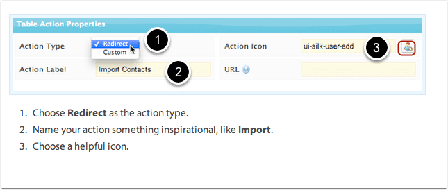
The majority of end user documentation should have screenshots, and those screenshots should include some sort of annotation. Adding an arrow, a circle, or number sequences can make end user documentation completely dummy proof, and save end users from having to figure out what to do.


Even if it seems obvious to you where to click, including a few simple annotations will go a long way in removing confusion.
4. Use video AND screenshots AND text
If you have the budget, the patience, and the time, you can do what Wistia does — create a video explanation, then include step-by-step instructions underneath the video.
This is a great way to do end user documentation. The video acts as a teacher to explain an overall process and provide some initial training. But after the initial training, end users don't need to watch the entire video again - they just need a quick reminder of what to do. The step-by-step instructions are great for the quick reminder.

5. Include links to related articles
When you reference another action, product, workflow, or term, it always helps to include a link to the related article. Otherwise, end users waste time searching for what you just referenced.

6. Make it easy to browse
if you only have 10-20 articles, then you don't really need to make them easy to browse. It's when you have over 20 or 30 articles that you really want to make a nice Table of Contents - especially if your documentation is online.

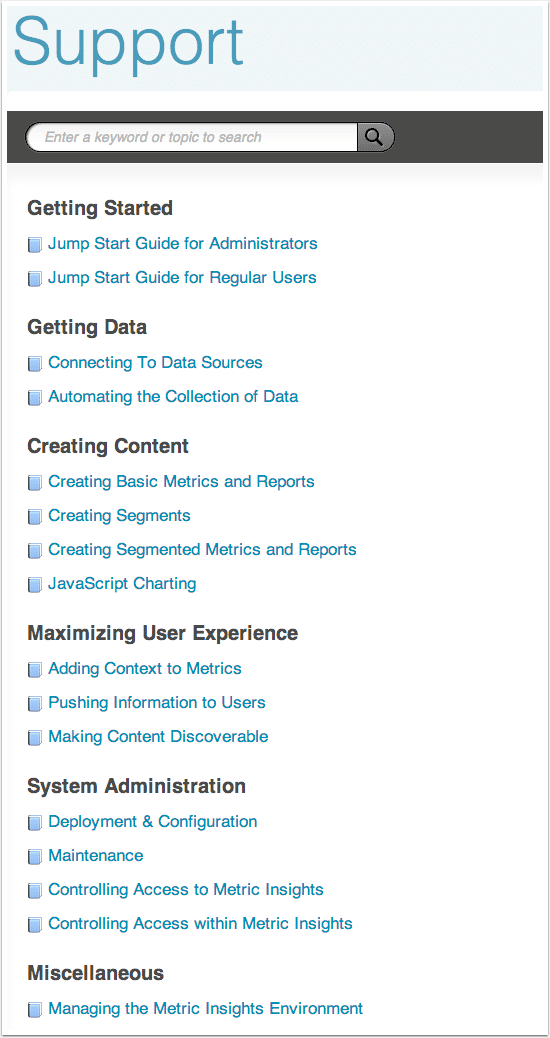
When your end users don't quite know what to search for, they can browse your documentation to find an answer. In this example, Metric Insights has organized their manuals into sections, and then each manual is broken up into chapters and articles.

7. Make it easy to search and find
Google has spoiled everybody. When your end users know what they are looking for, they expect to be able to type in a keyword and find an answer. If your documentation isn't searchable, then it's not going to be used very often.

Below is an example of an older ScreenSteps integration with Salesforce. It provided links to articles based on which Salesforce tab is open so end users don't have to go very far to find relevant documentation. Plus, it has a keyword search feature so end users can type in their questions and search your ScreenSteps documentation for an answer.
🔍 Related: 3 easy tips to make your knowledge base more searchable
The faster end users can answer their own questions, the less time you'll have to spend answering them yourself or showing them where the answers are.

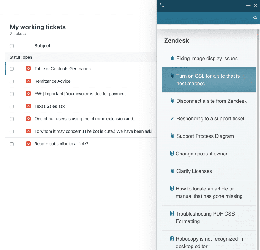
Now, ScreenSteps also has a Chrome Extension that allows internal employees to quickly find documentation related to a specific web page. In the example below, when a user is looking at Zendesk tickets, a support rep can quickly find articles related to tickets being resolved.

8. Show the end result
At the end of it all, what is the end user supposed to see? Here, Skuid does a nice job including a screenshot of the end result with a brief explanation to help end users determine whether everything was done correctly.

9. Show the steps and substeps
Including step numbers makes it easy for end users to follow along and piece together what they are doing. You can also take advantage of sub-steps to make your documentation easier to follow.

10. Give unique URLs for each article
If you were to click on this URL - http://help.screensteps.com/m/salesforce/l/211489-add-contextual-help-and-search-in-salesforce you would be taken to the exact article you need to answer your question about how to create a campaign target list. This makes it really easy for you to respond to questions with links to your documentation. Otherwise, you have to say, "Download this PDF, go to page 47, and on the 3rd paragraph you'll find an answer."
With a unique URL, you can respond in Chatter, email, in the communities, etc. This will send your end users to the exact answer they are looking for.

Why do any of this?
The goal of your end user documentation is to reduce the number of hours you spend explaining workflows, and reduce the number of hours end users spend looking for answers.
If you can remove hurdles your end users have to jump over in order to find answers, they will reference your documentation. And that will create self-sufficient end users who do the job correctly, in less time, and without constantly involving you.
Using ScreenSteps, you can speed up your documentation process and make it easier for your employees to find answers while in the workflow. Our robust content creation tools, make it easy to clarify a process so that employees can follow each step in a help guide.
Want to see how ScreenSteps can simplify complex procedures?
Watch this 8-minute video on how to create a procedure in ScreenSteps. In the video, you'll see how quick it is to add a text block, insert screenshots using our built-in screen capture tool, and add annotations to the screenshots.


.png)

