Make Complex Procedures Easier to Understand With 3 Tools in ScreenSteps
ScreenSteps Employee Training Platform | Call-Center | Ed Tech
The problem with documenting complex procedures and workflows
 Writing a simple "how-to" guide is easy. But, in reality, most businesses aren't dealing with "simple" procedures. Many procedures are complex, involving multiple steps, decisions that have to be made, sub-processes that need to be followed, and exceptions to the "normal" flow that need to be accounted for.
How do you write a help article that covers all of that?
Including all of the details is easy enough. While this meets the requirement of documenting the procedure, it doesn't necessarily make it easy for someone to use the documentation to complete the task successfully.
In order for knowledge to make an impact on your business, it can't just be documented. Knowledge has to be documented and usable. Help articles that are too complex with result in one of the following:
- The reader abandons the article because they get lost in the details
- The reader makes mistakes because the exceptions, subprocesses, or decisions were not clear
- The reader successfully completes the task, but only after a lot of re-reading, head scratching, and wasted time.
Reducing visual and cognitive complexity with better formatting
The best thing you can do to improve the usability of a help article for a complex procedure is to reduce the visual clutter while still communicating context. The user must:
- Know where they are in the process
- Clearly understand what they need to do next
- Not be burdened by additional information that isn't required at this step of the process
If you can reduce the visual clutter while still delivering context you will find that your reader will complete complex procedures in less time and with fewer mistakes (and with less head scratching).
ScreenSteps authoring features that help reduce the clutter
We have three features in ScreenSteps that can help you achieve this goal of context without clutter. Let's talk about how you can use each one effectively.
Foldable sections
You can mark any heading in ScreenSteps as a "Foldable Section". Foldable sections will automatically hide all content nested under that section. The reader can then expand the contents by clicking on the section title.
When to use Foldable Sections
The best times to use foldable sections are to show:
- optional information
- information that is based on a decision that must be made
- information that may or may not apply to the current reader
Here is one example of foldable sections (from the foldable section documentation - how meta is that?).

In this case, the reader may be using our desktop or web editor. Since the instructions for each editor are slightly different, we hide them under a foldable section. The reader is able to quickly expand just the information they need without being overwhelmed with the information they don't.
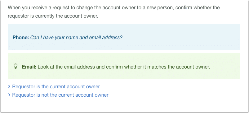
Here is another example of foldable sections that help the reader make a decision.

In this article, the reader is supposed to ask a customer for some information. What they must do next depends on whether the customer is the current account owner or not. By hiding the next steps under a foldable section, we make it easier for the reader to know what to do next.
Considering moving your standard operating procedures from Word or PDF to an online knowledge base? Our guide will help.
Inline links
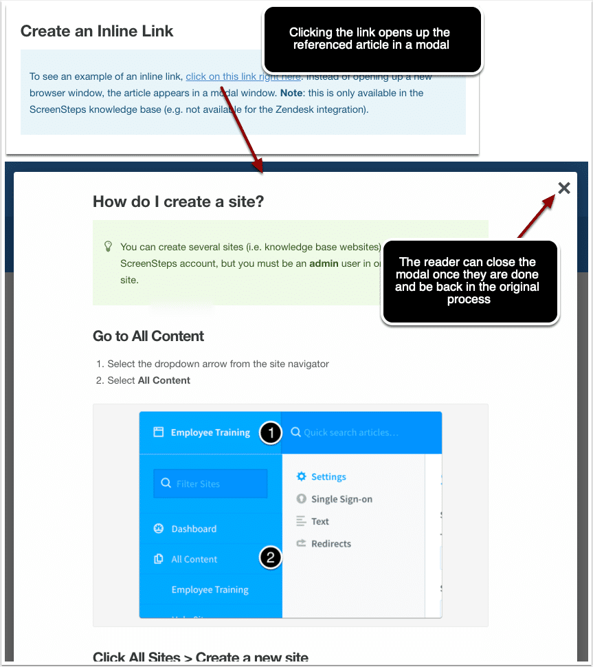
Inline links take the hiding of additional information a step further. With inline links, the contents of another article are overlaid on top of the current article in a modal screen. You can see an example of how inline links work in our inline links help article. (Unfortunately we can't use an inline link in this blog article because this blog article is not being delivered on the ScreenSteps platform - that is why you need to go to our help site to see how it works).
We all know that in most knowledge base systems you can create a link to another article. The problem is that usually, when you click on that link, it opens up a new tab in your browser. Pretty soon you have a dozen tabs open and you have lost your place in the original procedure. This can lead to confusion and mistakes.
But with an inline link, the reader never loses context. Once the reader finishes using the information in the referenced article, they can close the modal and they will be right back where they were in the original article. They never lose their place in the process. This can be a very powerful tool for reusing content, but also for maintaining context while reducing confusion.

When should you use inline links?
Inline links are prefect for:
- Subprocesses (for example "Before doing this you need to add a new user...")
- Policies that you want to reference in a procedure
Checklists
Sometimes instructions are NOT what a reader needs. Sometimes they just need help making sure that they don't forget anything.
Think of the example of a pre-flight checklist. The checklist isn't there to "teach" the pilot how to fly. It is there to make sure they don't forget any steps. Research has also shown that checklists can help people work faster and with fewer mistakes.
Checklists work especially well for complicated procedures that your reader performs regularly. The reader might be familiar enough with the process that they don't need a full help article, but the process is complicated enough that a checklist could help prevent mistakes.

For complicated procedures, ScreenSteps has a few nice features.
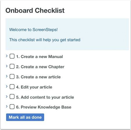
- You can create a checklist article that only mentions critical steps of the process that can't be skipped
- You can add an inline link at the top of the checklist article that points to the full procedure (just in case they need help)
- For each checklist item you can add additional, optional information that might be helpful (inline links, tips, etc.). These function just like foldable sections.
This combination of features helps you create a checklist that is easy to follow, but that also allows the reader to access additional information if necessary.
Conclusion
Hopefully this article has given you a few ideas about how you can use the various features in ScreenSteps to create easy to follow guides for your most complicated procedures. Take some time to think how you can apply these techniques. Your readers - and your business - will be glad you did.
Want to see ScreenSteps in action? Explore some of our pre-recorded demo videos.


